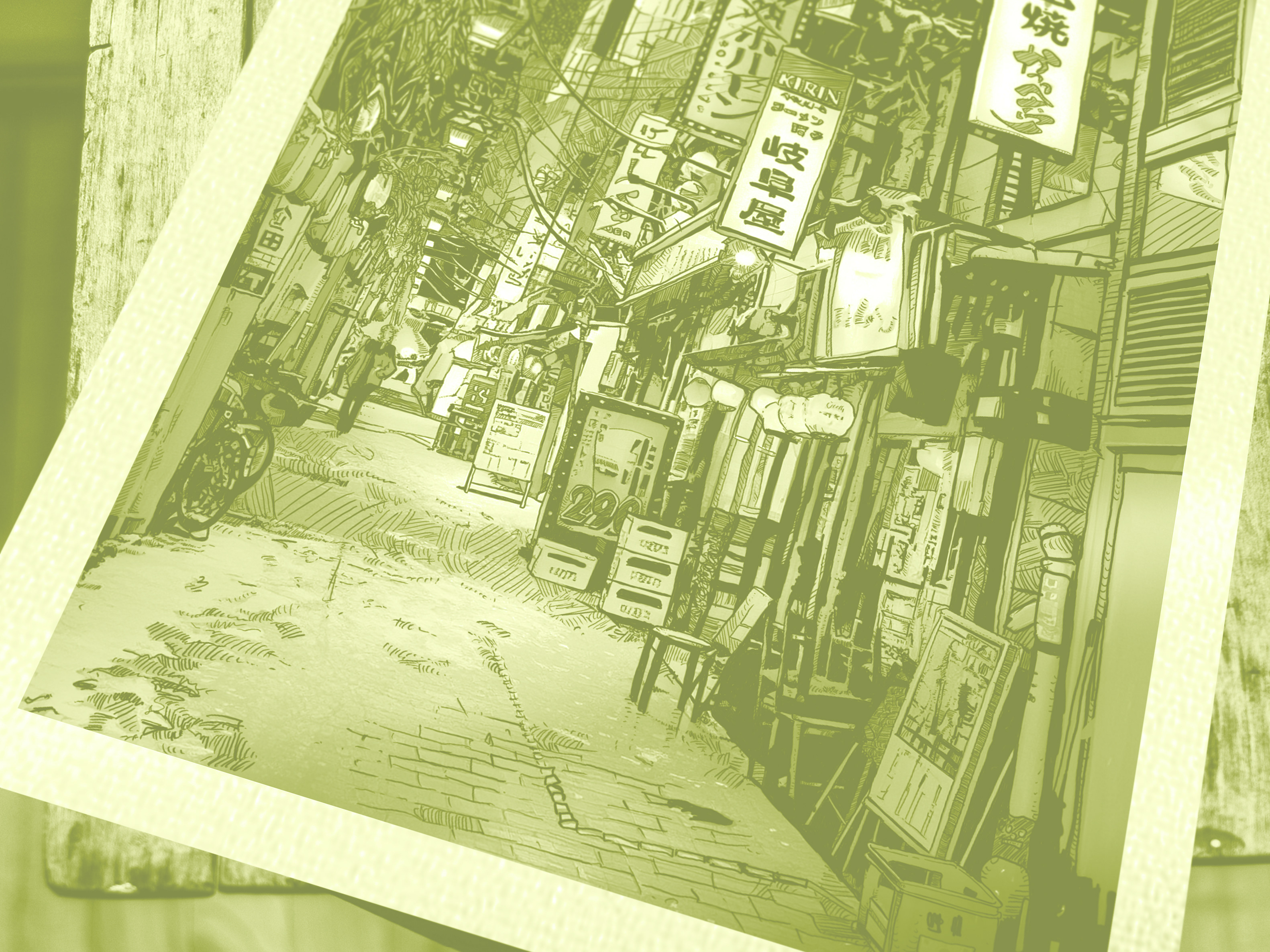
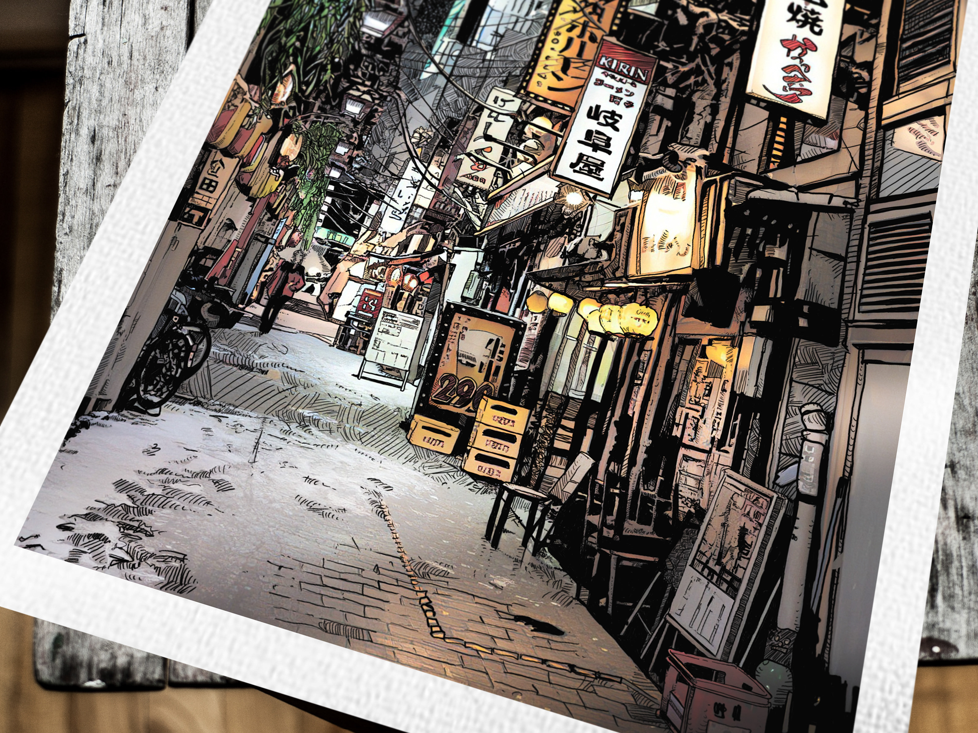
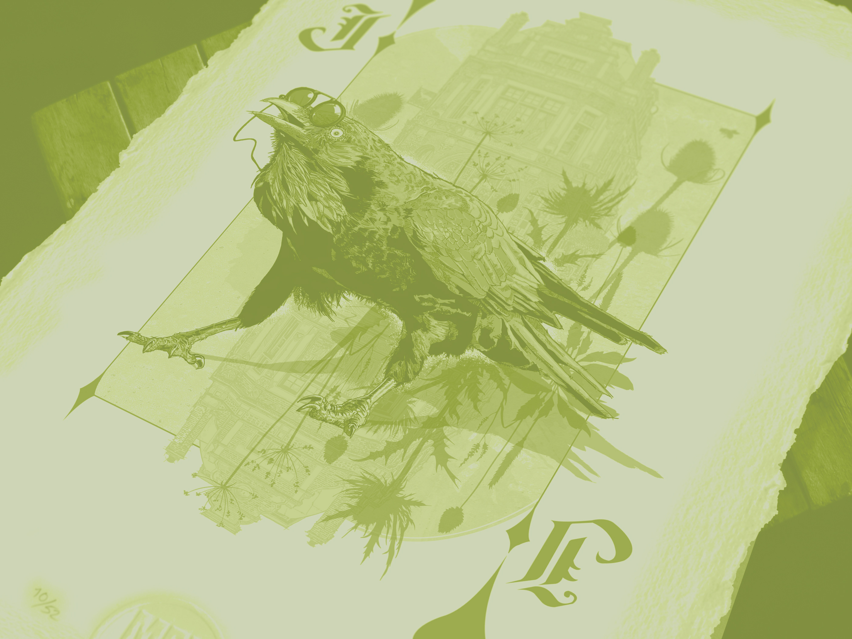
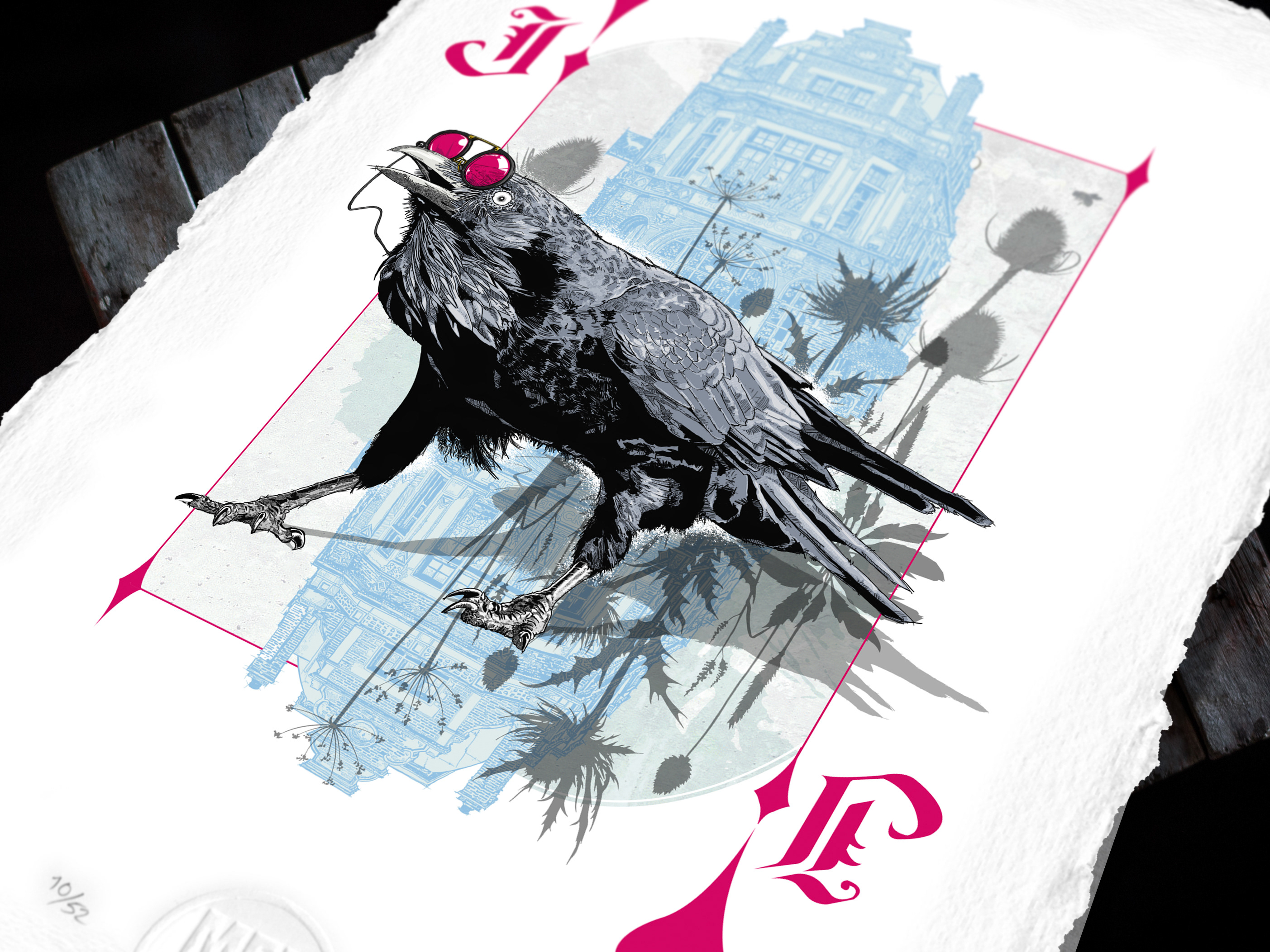
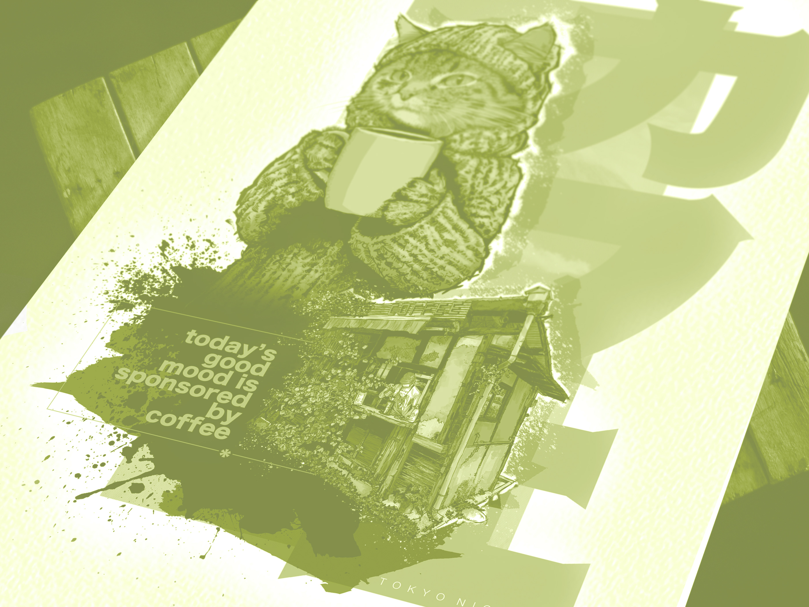
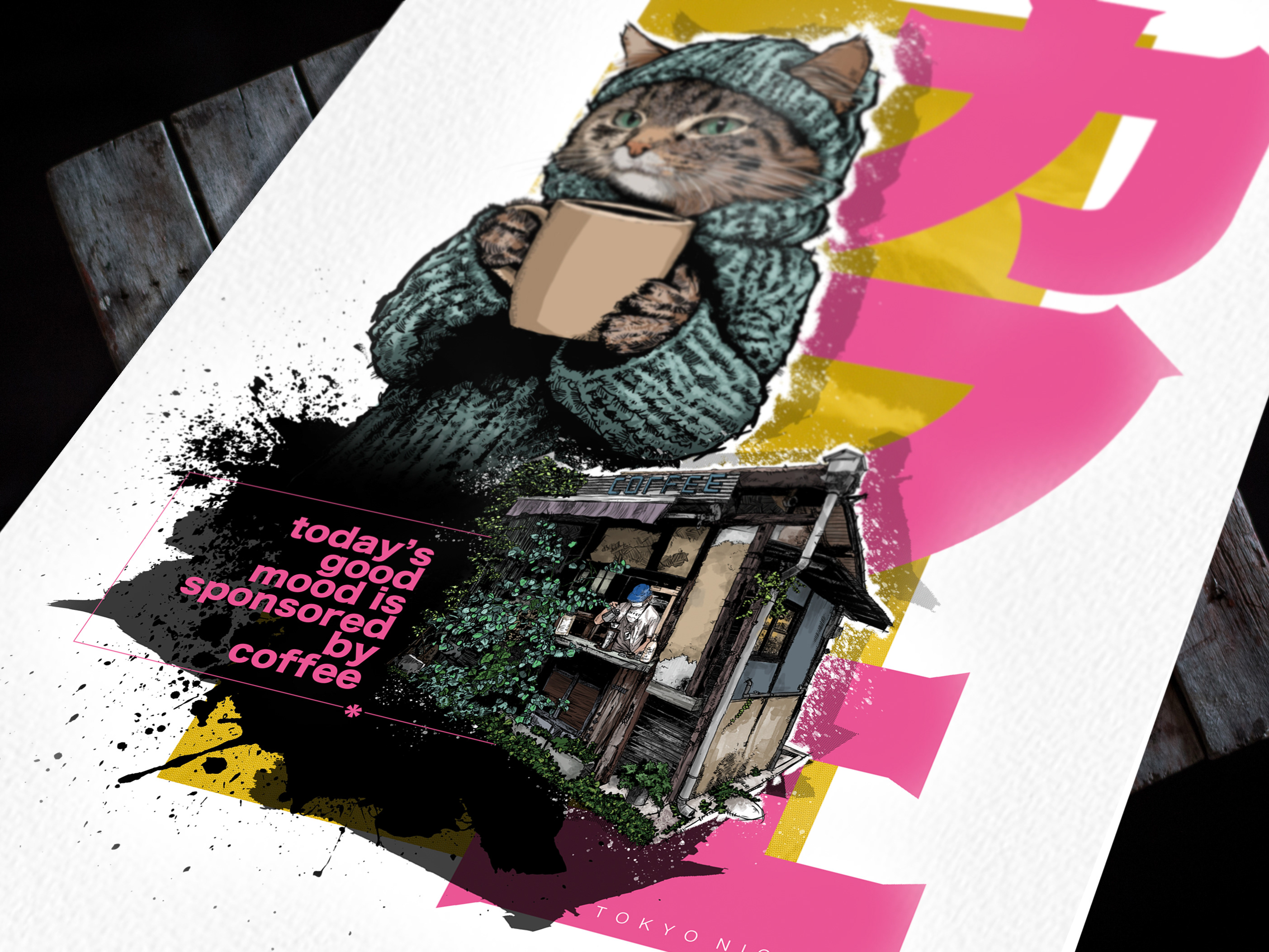
Process…
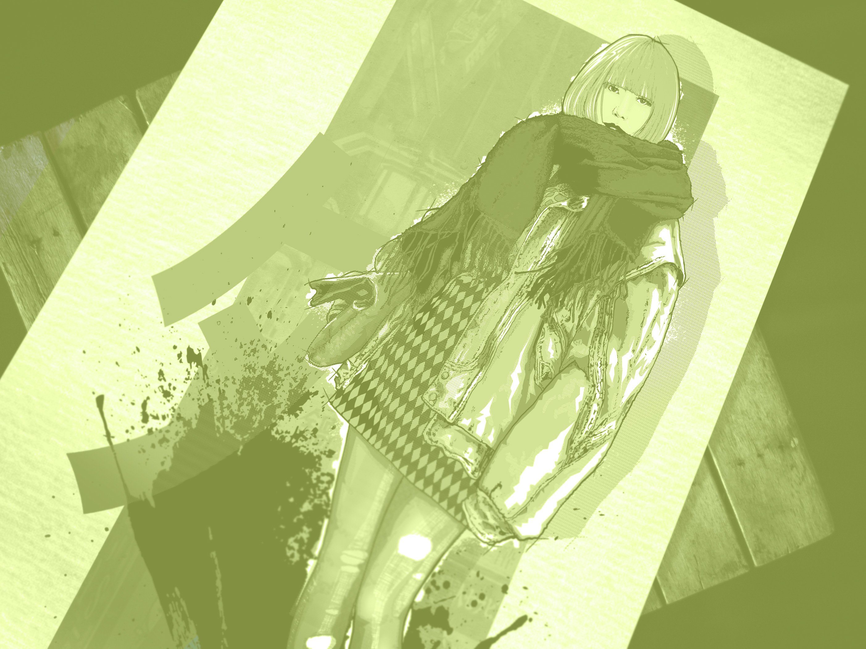
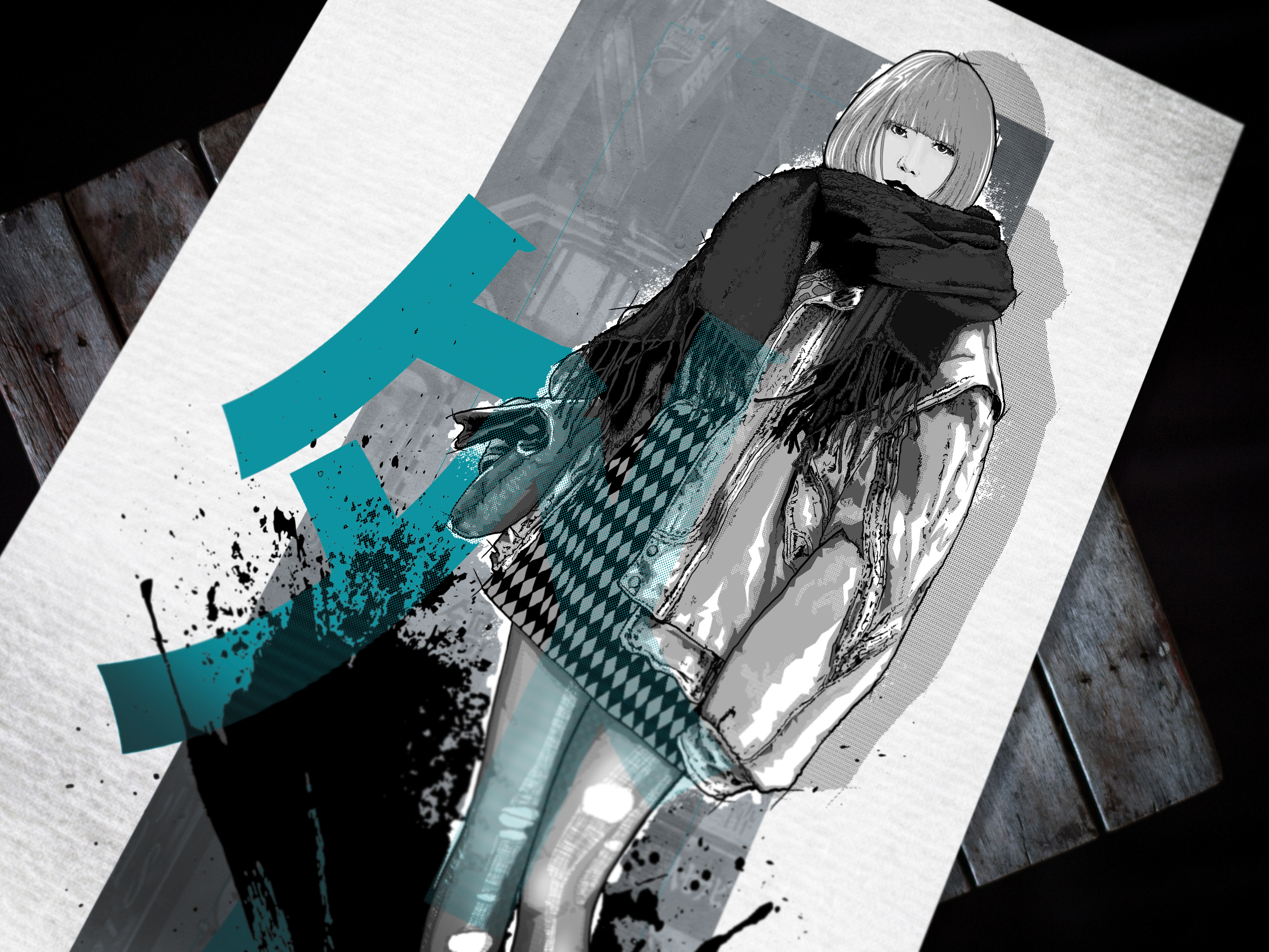
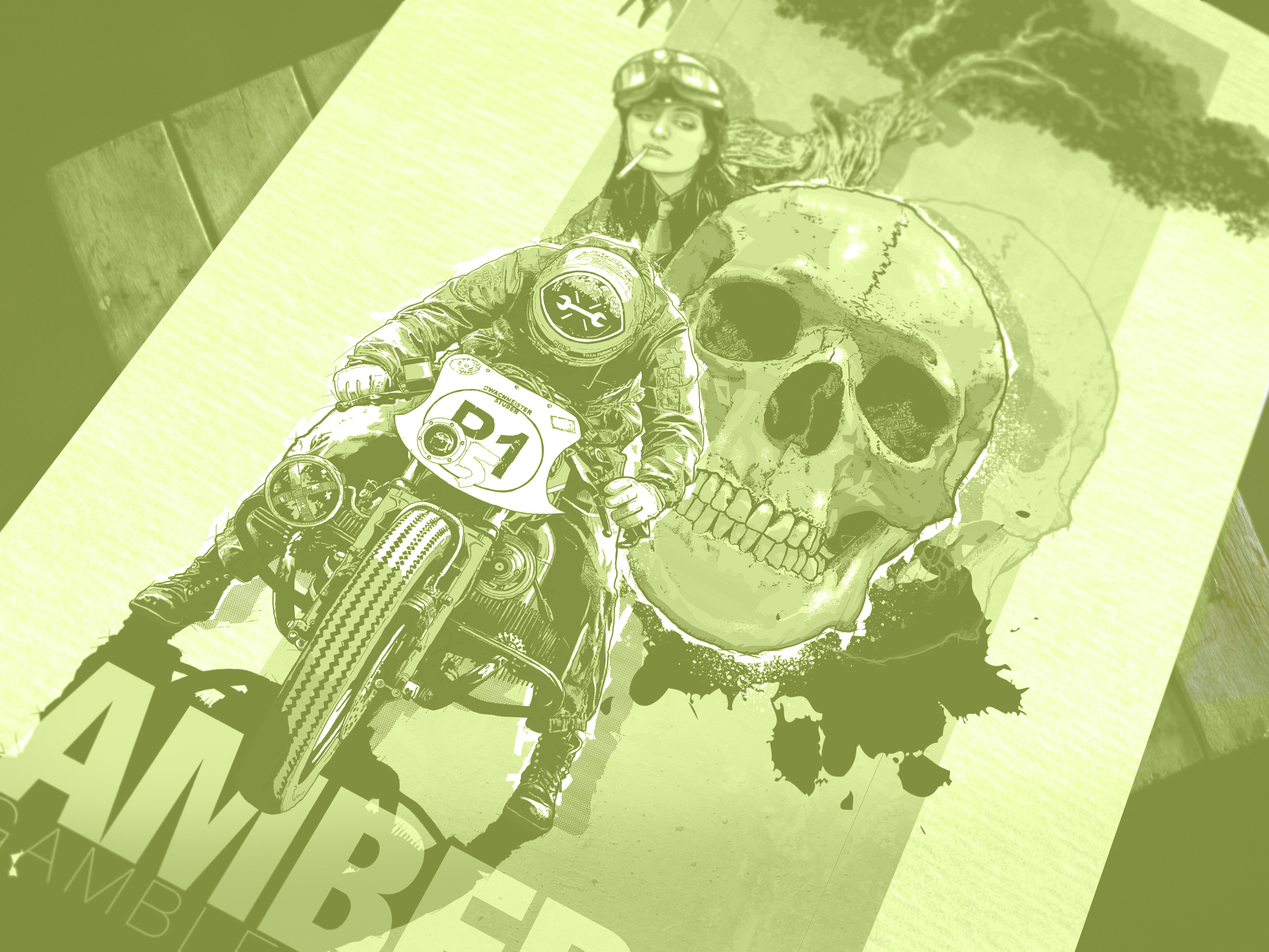
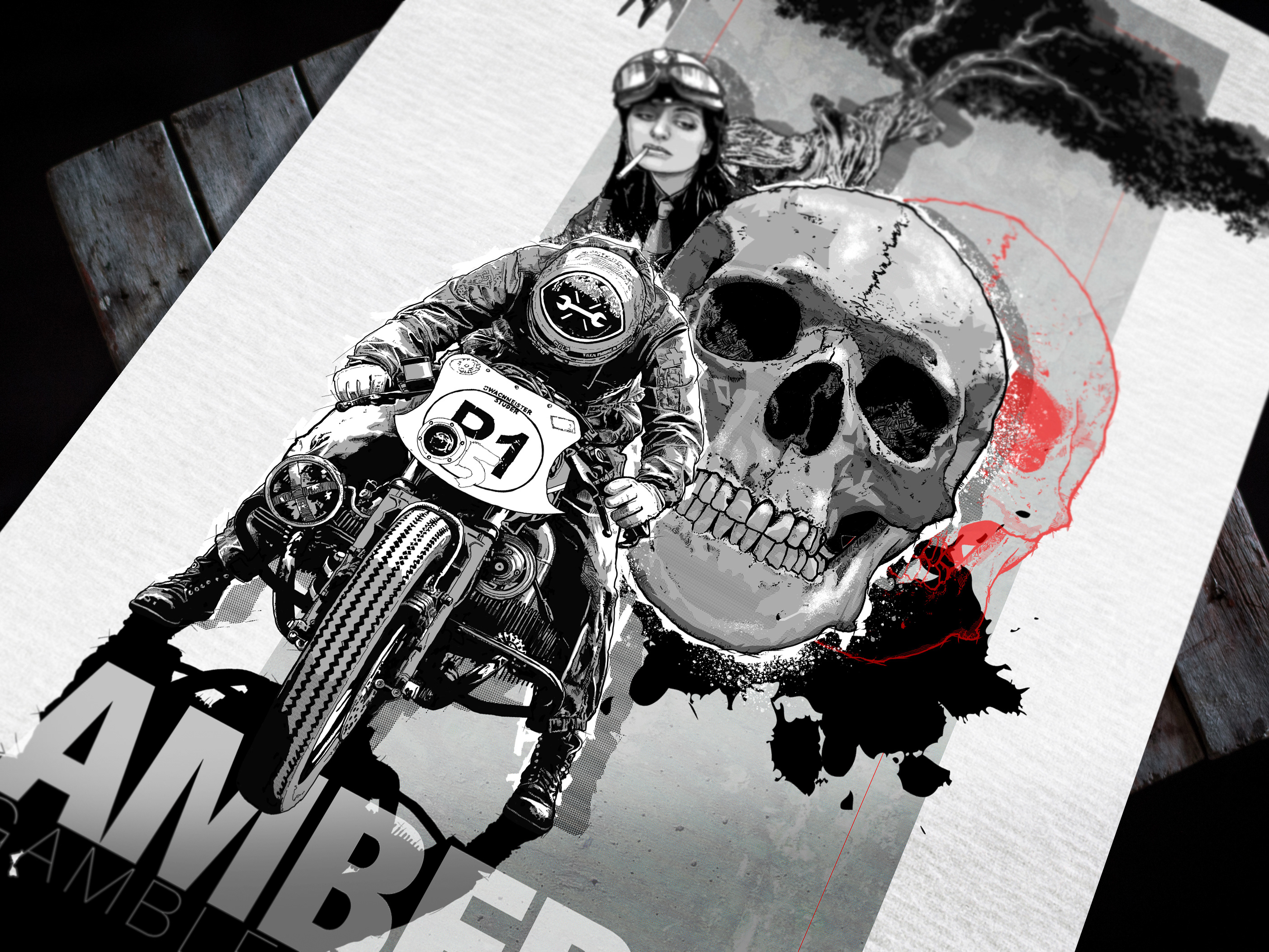
The process, a journey only, it would seem now looking back, made possible by Photoshop, indeed Photoshop has been the thread that has woven its way through all of my work for as long as I can remember, from the very beginning back retouching newspaper images in the early ’90s, seeing the endless possibilities the program offered, such flat colours, the layering of compositions, the incorporation of text, indeed everything it would seem the program wasn’t intended to be used for. Yes, the combination of Apple Pen, Procreate and the iPad is now the final nail in the coffin of ink and paper, however, in this process never have I followed the well-trodden path of the endless swathes of clones seeking hyperrealistic digital outputs. No, rather the program has offered a way in which to test endless variations of montaged artworks, illustrations very traditional in execution, illustrations that would seem to possess at first glance the qualities of ‘pen and ink’, and yet now fully created in the digital realm. Outputs created through iteration and endless experimentation on the Photoshop desktop, the juxtaposing of visual themes and often text created solely to stimulate thoughts and provoke questions.
…& Latest Work
London Pubs
The path of creativity rarely has a handy map, simple-to-adhere-to written instructions, nor simplistic pictograms for the impatient to follow, no, most of the time you are left wondering just how the leap from one concept to a seemingly unrelated outcome occurred, or, as in this case, just where the outcome is leading you. ‘Amber Gambler’ was, I feel, most definitely the start as images found stimulated memories and by so doing so became the reference for the final tryptic of work, but along the way, images of famous London Pubs cried out for their own interpretations via Procreate. What is shown here are the first roughs, the linework either finished or underway awaiting the move into Photoshop, what the story and context will be, possibly new, or even linked in some way back to the ‘Amber Gambler’ series, I don’t as yet know, any more than I am able to offer insight into what else may find its way into the final artworks.
Work in progress on the iPad, and with the Apple pen, the next London Pub
The first black and white image finished, the Roebuck pub
3 images were sourced of London pubs whilst working on the 'Amber Gambler' series, I was too happy with the first drawing, this, above, I think is starting to work, I'm happy with the level of detail and now moving it into Photoshop for the next phase. Created on the iPad via the Apple pen and in Procreate, below is a close up of the detail.
A close up of the Roebuck pub drawn by Brent Meheux
Italian Bars
The ‘Amber Gambler’ and ‘Tokyo Nights’ work was originally planned to be 2 of 3 sections based on 3 formative years for me, the 3rd was going to be entitled ‘Italian Bars’, and indeed I went so far as to pen the essay, see below, and work of the first image, below. However, in the end I just came to realise that in fact the work and essay pre-dated the judo years, the strong link that exists between the ‘Amber Gambler’ and ‘Tokyo Nights’ work, and so for now it is on the shelf.
The unfinished first 'Italian Bars' image, drawn in Procreate on the iPad as separate images and then brought together in Photoshop, by Brent Meheux
Italian Bars
That last year when judo was still a game, a distraction, a small hand prises the Tupperware lid, left over school meal desert the intended prize. “a school cruise, the Greek isles from Venice, well do you want to go? Frank where are you?” she calls out then disappears into the lounge screwed up paper in hand, also I might add, before I can answer, a slap on small puggy hands the parting shot, “no more till tea, you’ll spoil your appetite, Frank, SS Uganda?” I don’t actually recall saying yes, but the following day back to school I trudge, with slip filled out and deposit cheque in hand, strict instructions from Nan not to lose either.
SS Uganda, a relic from the 50’s, all tired and threadbare, patchy white paint trying desperately to supress the rust, but with little or no success, carpets worn and woodwork dull, hundreds of children crammed into dormitories, row after row of bunks, 3 high, once assigned bunks on tiptoe atop lockers we crane to peer through the portholes, bright sunlight and the pungent smells and sounds of the docks to the fore, the city laid out behind. Engine trouble delays our departure so two full days to take in the city, in groups with teachers leading the way we venture in search of culture, though more appealing to us the tat behind shop windows, row after row of flick knifes, gaudy papier-mâché masks, keyrings and gondolas of all sizes, groups break up into smaller ones, chaperones lost, soon I’m alone wondering the city, gazing at buildings all impossibly jumbled, a hundred jigsaws thrown together in the dark; standing atop tiny bridges, squeezed to the edge by the bustle of scooters I watch a myriad of craft plying their way through the city’s waterways, from floating dust carts to mobile market stalls. I take to the edge of the great square, pushed by pigeons and tourists off down a side alley until I am stopped by the water, by what seems to be the very edge of the city. Row after row of beautiful speedboats line the quay, all varnish and sleek lines, rising and falling on the tide, I recoil back a step or two as another comes in at speed, throttle cut she drops back into the water, before gently nudging the quay; off they step, impossibly elegant, undeniably stylish, the doorman nods as he opens the bar door, into the noisy and gesturing crowd the couple disappear, a wink and smile from the doorman to I as he ushers another couple into the fog of the inner bar, I smile before turning to retrace my steps to the ship. Back on board I note more than a few hands thrust newly acquired knifes through portholes, the fear of Italian customs getting the better of most, I can’t help but wonder just how many must lay under the water evidence to so many changed young minds.
A wife’s significant birthday many years later brings me back to a cosy Airbnb apartment off the Grand Canal, feasting on paper cones overflowing with fried sea food, Cornetto di Frittura Dipesce, bought at bar windows during the day, crostini and simple wines our evening fair. Then back to that bar, Harry’s Bar, Bellini’s and aranchini at elbow, the following day we take a speedboat back to the airport, newly purchased fedora firmly pulled down as I turn to take in the city from the water one last time, the finest of views.
So why Helvetica?
Helvetica, also known by its original name Neue Haas Grotesk, is a widely used sans-serif typeface developed in 1957 by Swiss typeface designers Max Miedinger and Eduard Hoffmann. Helvetica Neue followed in 1983, not long it should be noted before I began to use it, working on a certain newspaper of some standing of course ensured that Times Roman was equally a go-to font, however, over the years in my commercial work my preferred textural companion in all its wonderfully exploitable variations has always been Helvetica. Hard as I may try over the years to find alternatives, or mimic new and clever visual trends, it always manages to somehow be the perfect foil for my visual experimentation, like that comfortable shirt with the somewhat threadbare collar, or the shoes deemed possibly unable to undergo yet another resoling, a companion of too long a tenure to forgo now.
